From a saved job to a considered application.
A bilingual, phone-first job-application companion that keeps the candidate in control of every word that gets sent.
A job search is more than writing a CV.
Job seekers move between listings, documents, messages and reminders — mostly on their phones. A saved role loses its context; a tailored CV drifts away from the application it belongs to. AI speeds up writing, but plausible wording isn't a truthful account of someone's career.
Reduce effort without removing judgment.
How might we move someone from “this job looks interesting” to a prepared, traceable application on their phone — with evidence, uncertainty and approval visible throughout? The answer was an opportunity-led workflow, not a document editor.
These are product hypotheses and design motivations, not findings from a documented user-interview study.



One connected application journey
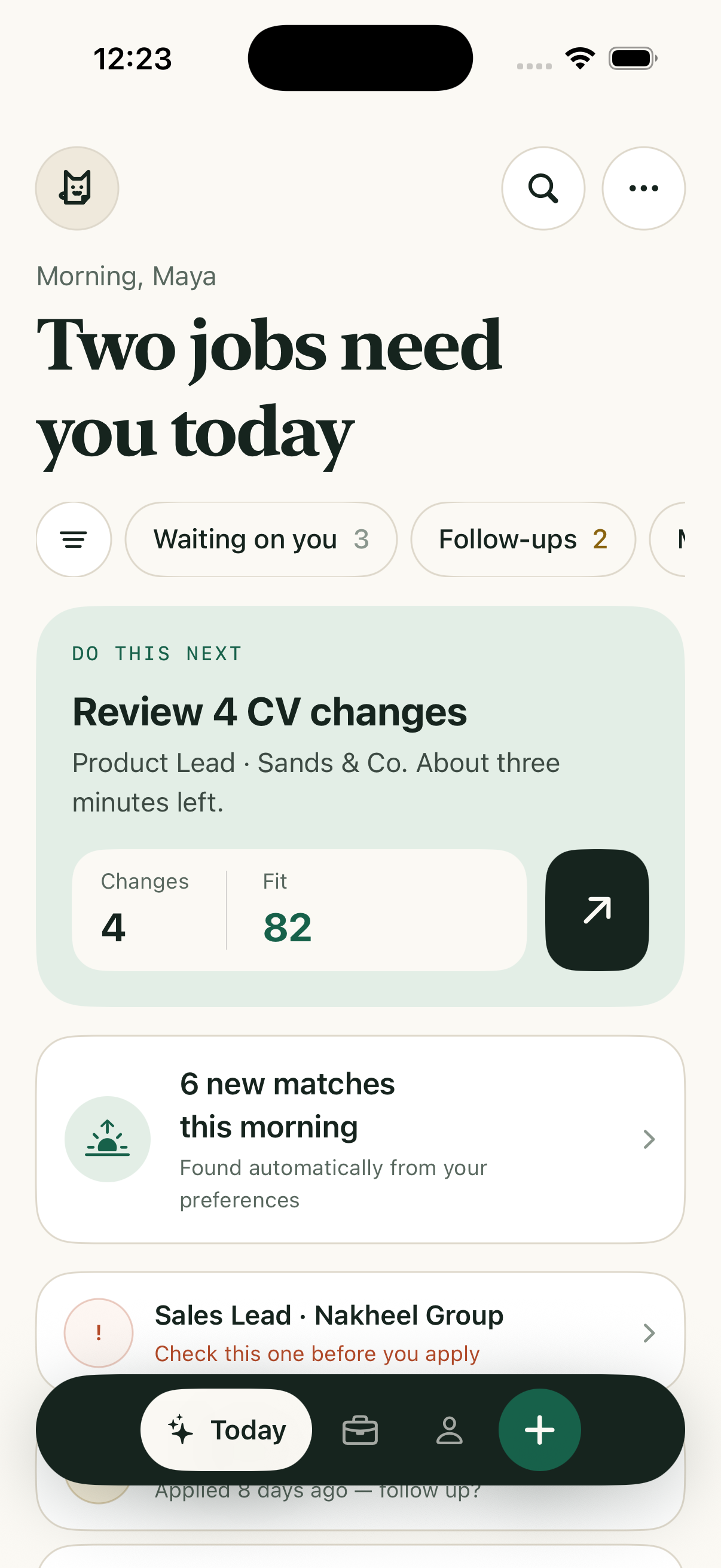
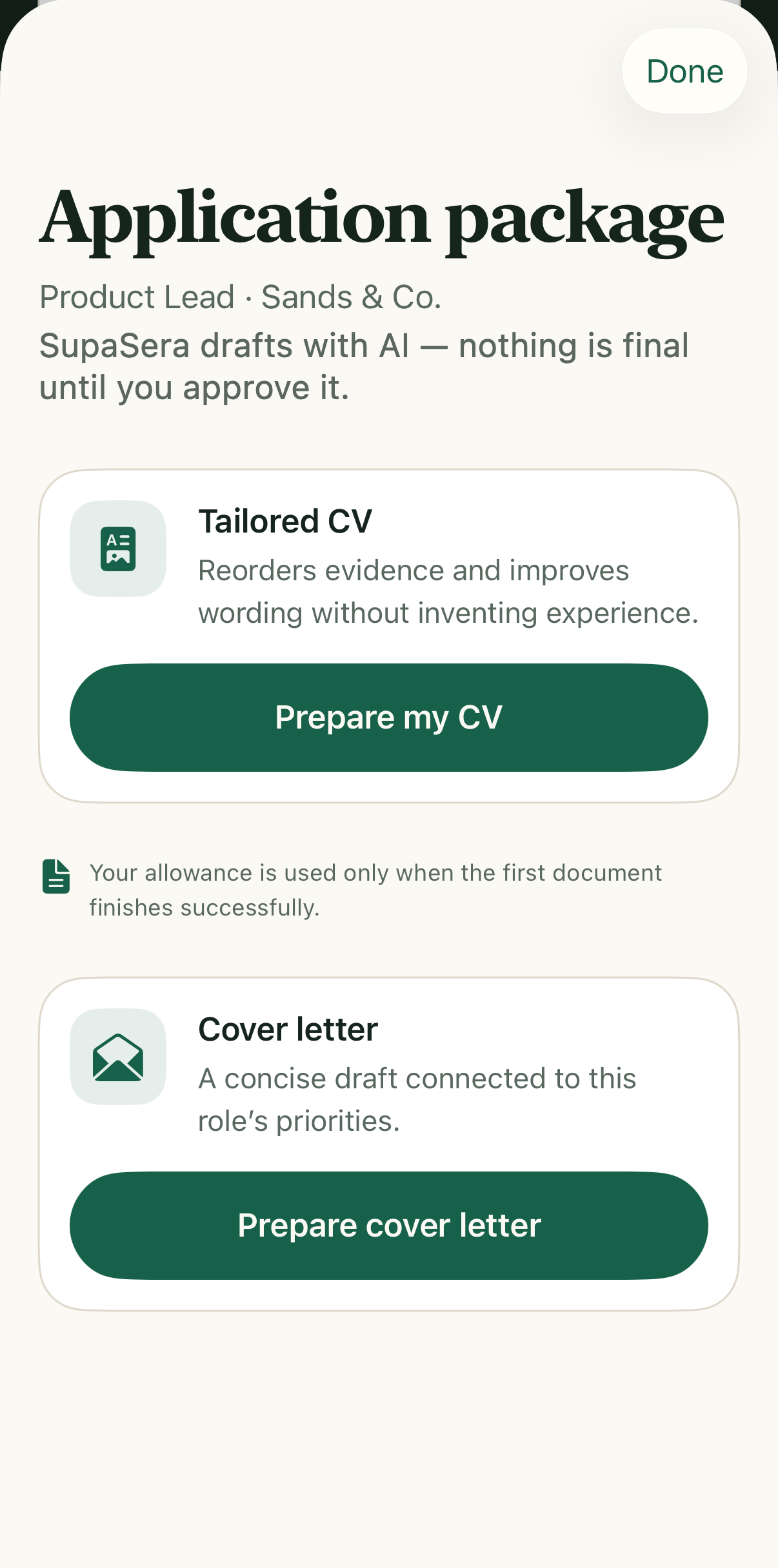
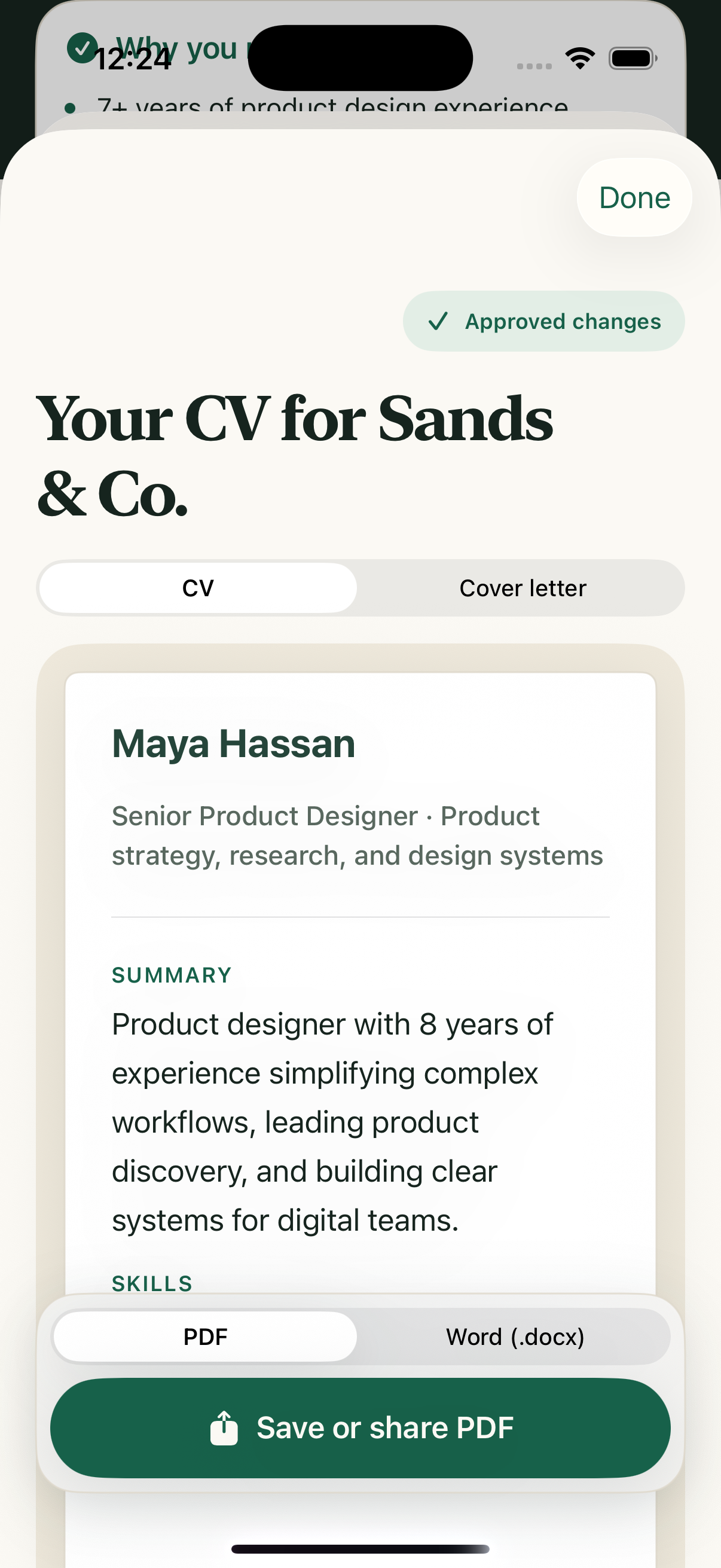
Each job becomes the context for analysis, preparation, review and follow-up. Preparing a document never means it was sent — SupaSera doesn't apply or contact employers.
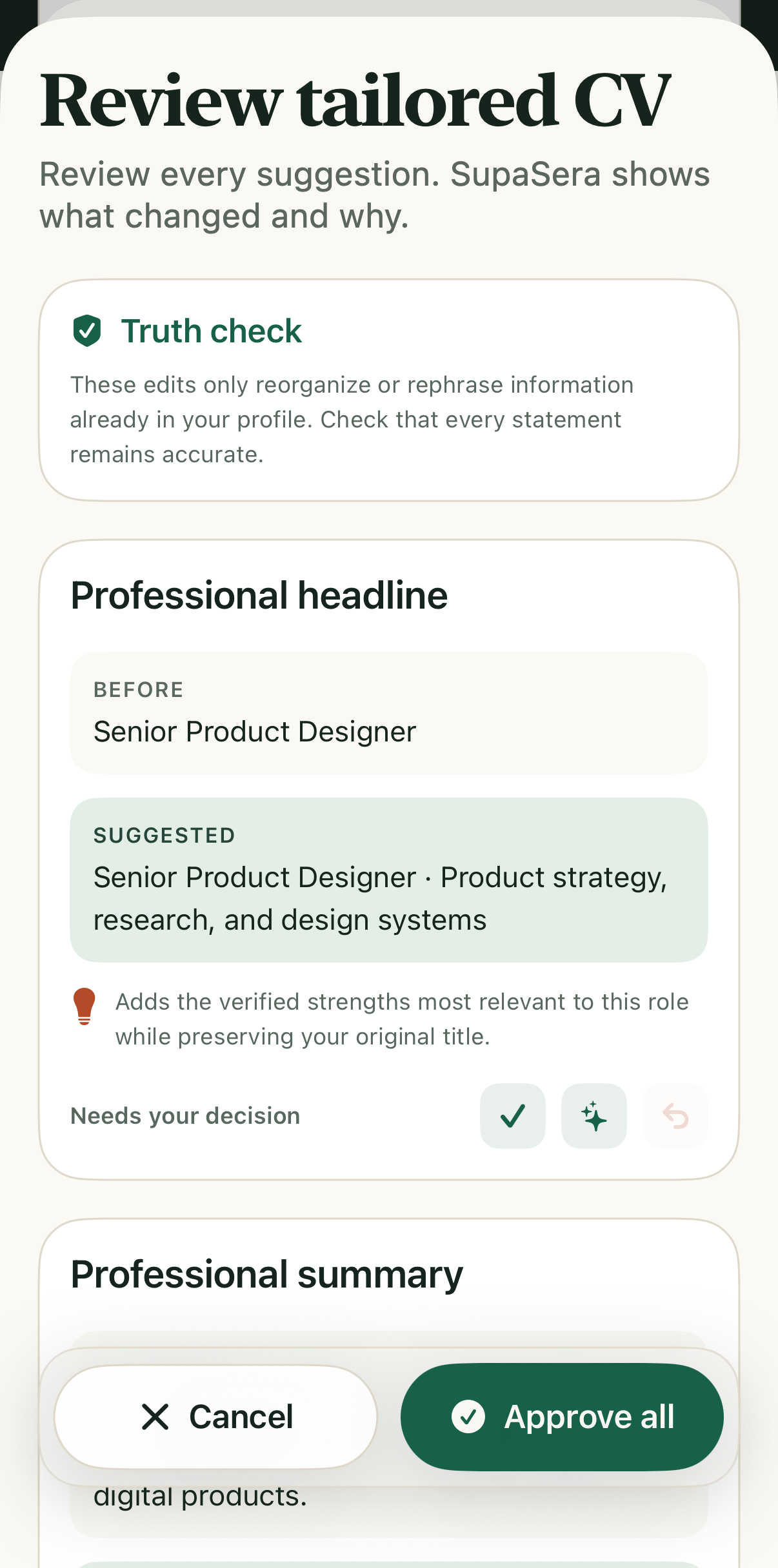
Candidate decision point — nothing moves forward without explicit approval.
Meet the user where the opportunity appears.
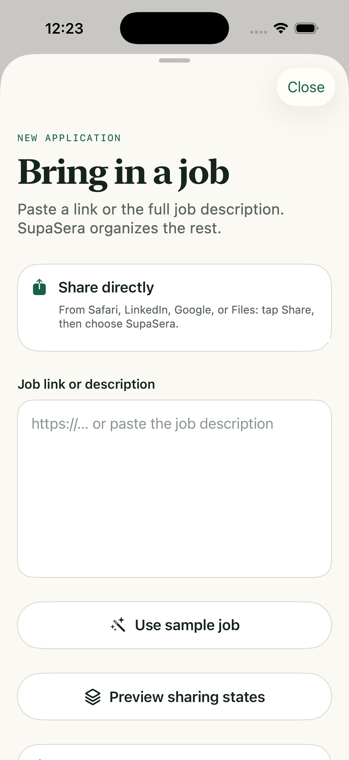
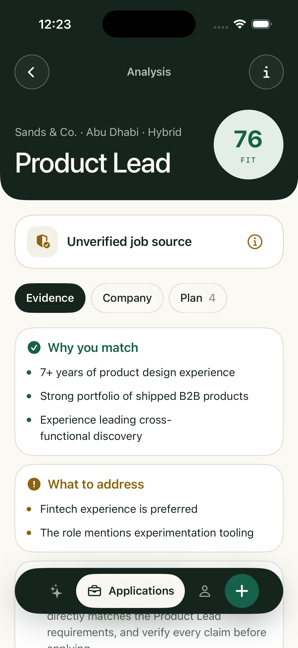
The native Share Extension brings a job into SupaSera from whichever app it was found in. Its only job is capture and handoff — review continues in the main app before any paid analysis.
Make AI output accountable to the candidate.
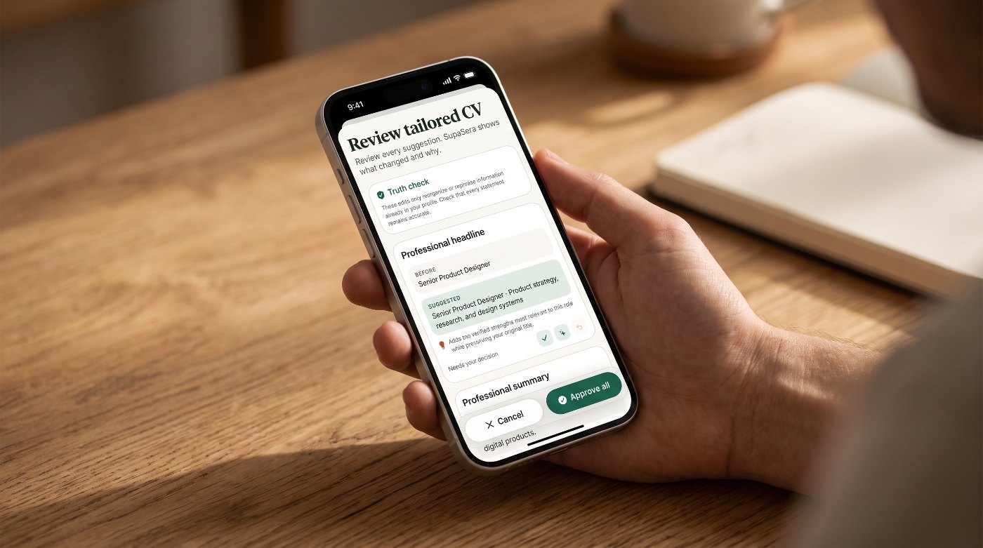
A confirmed master CV is the factual foundation. Generated wording must preserve real experience, employers, dates and qualifications — and every proposed change is shown with its reason before it can be used.
Treat Arabic as an interface requirement.
English and Arabic are both first-class, including layout direction and navigation. Company names, URLs and emails keep readable direction inside an Arabic screen, and interface language is kept separate from document language.

Small corrections that protect the whole journey.
Pre-submission changes from project review and hands-on testing. No formal usability-study results are claimed.
Full-row hit targets
Profile rows became tappable edge to edge.
Clearance above the nav
Log out stays reachable above the floating capsule.
Edit master CV from Profile
The factual source is one tap away.
Visible Log in route
Returning users see it alongside Create account.
Salary warning, not a filter
Pay below the preference is flagged; the role stays available.
Momentum, not streaks
Active days are recognised without a consecutive-day penalty.
Key design decisions
Warm, editorial, and focused.
A warm paper canvas, deep green actions, large serif headings and quiet bordered cards — warmth for an emotionally demanding task, without losing hierarchy. A floating navigation capsule keeps the main destinations close; large pill buttons give every screen one clear next action.
A submitted product, with outcomes still to measure.
iOS 1.0 (build 3), Monthly, Quarterly and the subscription group were submitted together and shown as Waiting for Review. No download, revenue or retention figures are claimed here — those wait for evidence.
- Submitted
- iOS 1.0 (3) · 9 Sep 2026
- Subscriptions
- Monthly · Quarterly
- Native test run
- 110 passing
- Backend suite (earlier)
- 67 passing
- App Review access
- Fictional profile + tested OTP
What the work suggests
Usefulness depends on the transitions as much as the AI output — source to analysis, facts to wording, documents to next action.
Trust needs visible decisions and recoverable states.
Bilingual support shapes layout and content architecture from day one.
Release preparation is part of the product: reviewer access, real purchase screens and complete metadata decide whether the work can be evaluated.